Tuesday, 17 May 2016

Hair & Makeup inspiration for Louis XIV mask

I have gathered four images of Louis XIV inspired hair styles that have caught my eye as an inspiration towards my final outcome, each style has stood out to me for different reasons and hope to create my final style by selecting small parts from each image. With then developing into my own idea for my final look.
Image one: I selected this image towards my research as the movement in the bouffant really caught my eye with then leading down to the nape applied into pin curls with then tight ringlets with the tail of the hair draping over the shoulder. The sections of this hair I'm thinking of incorporating into my final style would be the pin curls and long ringlets to give the Louis XIV feel to the hairstyle.
Image two: This image really caught my eye as I love the hair & make up as a whole, really love the bouffant and the hight of the style. This is most definitely an style I want to incorporate into my final hair design, as I want the final design to have height into the hair as when my mask is held to the face I have made the mask to have flame like shapes to come out of the mask. So would still like the hair to be shown when the mask is held to the models face so you still get the feel of the Louis XIV styled hair.
Image three: Again chose this image as I love the hight of the bouffant this image shows image one and image two together with the tail of the hair draping over the should and then image two the bouffant. This image showing more of an high fashion look with a more textured style as image two showed more of a neat set. Which I do quite like this textured look to the hair and feel it relates more to the high fashion style.
Image four: This image is from the Autumn/Winter 2009/10 Basso & Brooke- Powdered skin & wigs "Let them eat cake" catwalk that sparks off inspired hair and make up from Louis XIV. With this hair I really like the four rolls that go up each side of the head it looks as if its been applied out of card to make these rolls and not hair, and I really like this idea! I think I would like to incorporate pin curls like the same style but with hair and not cardboard even though I think is amazing look for high fashion or if I was to attempt this myself maybe try a different material to make it my own!

Above I have inserted a very rough sketch (very rough) just to give an en sight of the idea I have in my head to create for my final hair style. I have been mainly inspired but certain sections of the images I researched and the ones I really like I have taken into my design putting all three together to make my final design.
Saturday, 7 May 2016
End of year: Evaluation
This first year for me has been a roller coaster as I've had
highs and lows within the course. Area's I found I struggled with more than
others, but this is why I'm here to learn more with the things I struggle with.
I found fashion being one of my favourite lessons and sad to learn we won’t be
having this in the next year as I found Branka taught us so well and feel my
skills have come a long way since our first lesson. Fashion hair I did enjoy
but found I preferred period hair as I felt this lesson was more challenging
and felt I learnt more as period hair there is more to it. Which some lessons
were most definitely challenging as this year my most challenging hairstyle I
just couldn't get to grips with was the 1920's finger wave's which this really
annoyed me as I was looking forward to learning this hair style as I'm a big
fan of the 20's. Each lesson learning this style was just a struggle and a very
frustrating one it became. I didn't overcome this as I only could really get
one S , this is something I defiantly need to practice this style at home to
try and apply an full head of finger waves. I did find this lesson my most
challenging but I found each style I always applied well and came out with good
final images and each lesson also found I left with learning so much, and
looking forward to next year to challenging myself to new styles we are taught.
Period make up I learnt a lot about the history of makeup and the brands of the
time that are still big today, learning the background of makeup and the styles
have really helped me identify the era's. With all the different looks I
enjoyed term two more as I felt term one was really good to learn all the no makeup
looks but found it all looked very similar each lesson whereas term two was
more of a challenge to us and felt I learnt a lot more. My struggle was the
balancing of the lip, with Denise giving me the tip of standing right in front
of the model making sure my nose is in line with the models which this did help
me prevent the unbalanced lip. Finding theatre my most struggle of all only
mainly the bald cap weeks as I did struggle with time as I took longer to apply
the cap its self, but I feel if I applied again I would be quicker on my 3rd
application. I think it’s a very fun lesson theatre but this year has shown me
what I like to do more of and my strengths and found theatre isn’t really for
me.
This year I would say has made me realise I would really
like to go into fashion with also freelancing in weddings as I just enjoyed
fashion so much and a lot of my work experience revolved around fashion and I
enjoyed it so much I didn’t feel like I was working for 12 hours on set I was
doing what I love for 12 hours. With learning what I’m learning at West Thames
and also the experience I’m getting and the skills I’m learning on set I’ve
seen so much improvement on all area’s and will carry on getting this work
experience as I feel it’s really helped my skills alongside university. If I
was to change anything on this year would be to keep on top of my work instead
of leaving last minute as I was putting work experience first and doing as much
as I could but then this has made an impact on my work, so next year I will be writing
myself up a timetable so this doesn’t repeat its self for my second year. As I
felt I was doing everything more last minute and feel my work isn’t at a
standard I know I can produce. I’ve noticed this myself and will make sure I
change for my second year! Another issue I have noticed within myself is not
being able to deliver a presentation well this is due to just being so nervous
as when I’m in front of everyone I get terrible stage fright and find I can’t
sometimes even get my words out, as this really gets to me. I will try and
practice more as I would in year two try and get higher than a pass on my presentation
so this will be on my list to push for within my second year.
Overall I’ve really enjoyed this course and really happy
with how far I’ve come within this year I feel really proud of myself as in assessments
I have pushed myself and set myself with a challenge that I would have found a
little hard in the lesson as this is a risk doing this but I want to set myself
a challenge and not stay safe with styles I know I can do. Each of my final
assessment I was proud of how far I pushed myself and the outcome I produced
made me so proud and that’s from learning I have achieved this year at West
Thames. If I could change anything about the course is carry on hair and make
up till we finish as in term three we don’t do any apart from our final assessments
in term three, which I’ve really missed our hair and makeup lessons and just
feel it’s a very long break of not doing any practical within hair and make-up
and would of loved learning for that extra one month, but understand why it has
been set this way due to end of year projects. Also a good incentive to get
students out to work experience to keep their skills up as this is most definitely
what I’m doing so I don’t lose the skill. Looking forward to returning in year
two to develop my skills even further than what I’ve learnt this year.
Wednesday, 9 March 2016
Magazine cover: Evaluation
For this assignment the brief was to create a magazine front cover in
the style of SS15 and to collaborate with a photographer. When Branka first
delivered the brief I straight away was not so keen on producing this outcome
as the worry of getting a photographer and a model in a city I know no one! So
when this brief was set I wasn't so excited. But little did I know how much
this assignment would help me not only with this project but with future
projects!
To begin my search for collaborating with photographers and models I
came across a website called the freelancer club that you could set up a
profile reflecting what creative area you worked in. As this was a site for
freelancers in the creative industry this being mua's, photographers, models
and stylists. So I began my profile by showing the world of freelancer club I
was an MUA by uploading work I have created so really just like an on-line
portfolio for other creative's to see. Once I had made my on-line portfolio I
posted a job seeking ** fashion photographer and model needed** and stated what
the job would consist of (my magazine photo shoot). When posted will take up to
twelve hours for the team to let be put live onto their site. When it went live
I had so many responses and options to network with! With a big selection to
pick from I made sure I looked at their Instagram’s and websites as I had a
high percentage of photographers to pick from, but finding someone who I felt
would collaborate well with my work and chose a photographer called Simon
Morris who I couldn't wait to work with!
With such a great outcome with the photographers I didn't win so much luck
on the model side of things as all of the models on freelancer club wasn't what
I was looking for! But Simon got us a model but on the day just didn't work the
camera like I hoped and the whole studio outcome didn't work as well as I hoped
as I felt it was no longer my project and they just took over! So after feeling
really excited to collaborate with these creative's it all came crashing down on
the day, but I see it as work experience so wasn't a day wasted I learnt from
it. Next time I need to take charge more as I obviously didn't the first round
and it showed!
The second time round I Shot with Chris Ennis and model Tasmin Taylor
and this shoot went so well the photographer listened to everything I said the
model worked the camera how I asked and everything just fell into place great!!
And the relief of this was amazing as I did panic after the last shoot but I
got here in the end and I felt so proud. Even though I had stressful times with
this project sometimes got upset but only because I really wanted to succeed
well in this project and I really think I projected myself in this project in a
professional manner and couldn't be more proud of this outcome.
Excellent project to be given, at first I wasn't keen but I got it done
and loved it! Made me feel like I was a professional and networking with other
creative people in the industry was great and I learnt lessons along the way!
Second attempt magazine cover: Final

Final

Location : Osterley park
Prouducts used
foundation : Mac face and body c1
concealer : derma palette d3
powder :kroylan translucent powder
contour : mac contour powder shadetser
highlighter ; mua light
blusher : illamasqua cream blush, mac powder blush flush
freckles ; illamasqua brow cake peek
eyes ; morphe caramel sparkle
mascara : mua
brows ; mac brow gel
lip ; mac lip liner spice and vaseline
hair tools: hair straighteners
tail comb
hair spray
hair oil
So here it is my final magazine cover and what a ride it was! But i couldn't be more happier how this second attempt came out. The day just went perfectly, sept from the freezing weather and the wind. to start the look i first took out an risk assessment on my kitchen as this is where i styled my model. as this is where the most natural light was coming in! with the kitchen being hazard free for me and my model, i got her seated and began the treatment for my ss15 look!
starting with prepping the models skin so its flawless for camera.cleansing the skin first followed by toning the face and finishing with MOISTURISING so when i apply the base it will be glowing and flawless for the camera!
starting with the eyes while the moisturiser sets into the models skin. applying caramel sparkle to the lid lightly buffing into the lid taking up to the crease of the eye. to bring the brow bone out i highlighted with mua highlighter and buffed in so this would give slight definition but nothing to heavy as i don't want it to bounce too much off camera. for the brows i wanted to give them definition and frame the face still but not heavy in a natural form and to create this i applied mac brow gel combed through the brows doing exactly the job! with a final touch of mascara again wanting to define them so applied little to give a natural lash look.
with finishing the eyes and the moisturiser set into the models skin i applied mac c1 face and body as i wanted coverage but not heavy and face and body is great for camera and i would RECOMMEND for brides too if you want a light wear that photographs well! buffing this into the skin well making sure all buffed in. with a slight redness coming through on the chin as my model had a few red spots but i would normally of used the green concealer to contract the red but didn't have any on the day and lightly pressed derma concealer onto the area that needed. also taking this under the eyes to take out any darkness. once the base and concealer had been applied i lightly dusted the face with translucent powder. and contouring the face with mac contour powder shadester taking this under the cheekbone and onto the apple of the cheek and taking up the cheekbone applying illamasqua cream blushand then dusting the colour over in a powder blush flush by mac. and to finish the cheek by highlighting the height of the cheekbone using mua highlighter buffing this in so isn't too heavy but gives that natural height of the cheekbone. for the lip just lightly applied mac spice liner and to add a slight shine applying vaseline.
to finish the make up application was to apply the preen look the false freckles which i was was worried to apply as i've never applied before so this could of gone terribly wrong or excellent!! applying using my mac liner brush using illamasqua brow cake diluted with a little water and randomly applied to the models face.
for the hair wanting to aim for a natural wave look, first taking the models side parting into a middle parting and then sectioned the models hair into four sections brushing through making sure all tangled free and then curled with the hair STRAIGHTENERS as i wanted to create real big curls as i wanted to create these into waves. once all applied i then applied hair serum to my hands rubbing together and then running my fingers through the hair taking the curls into waves and the serum giving a glossy soft application and finished with a light spray of hairspray.
Second attempt Magazine cover: Hair and make up inspirations

Make up - PREEN SS15 supremo Val Garland took this look to a very natural no make up look. To reflect the ss15 look applying several lip, eyebrow pens and pencils to apply false freckles by spattering across the cheeks and noses. And what a beautiful make up to reflect ss15 as in make eyes spring/summer you start to see warmer skin tones, glow to faces passing you by on the streets. Less make up being worn because I know in the winter I am known to layer my make up on in the winter due to my pale complexion. When the sun comes out though I tend to get a warm glow my freckles start to blossom out and to just make me feel more alive will add some bronzer and mascara reflecting a similar look Val Garland applied for PREEN SS15.
Hair - This season was all about the centre part hair styles with boho waves that give mesmerizing effect to silky smooth locks. A beach style hair do to reflect spring/summer with soft flowing waves combined with bare beauty. The look implies its undone but is simple yet lovely and has been ruling the cat walk making it a top trend for the season.
After researching and looking into these looks more as I found them so beautiful from the trends and really stood out to me! Because if I seen this look of a magazine cover it shouts out spring / summer and I need to try something I've not done before as my last look I had already done something similar in term 1 for my assessment. So I think things do happen for a reason! My first shoot was meant to go wrong because I wasn't really experimenting with different products and trying new skills. But this look I will be experimenting as I've never applied false freckles before so this could go extremely perfect or awful but I need to step out of my comfort zone. What this space...
Second attempt of cover : Inspired by vogue

So with my first attempt of the magazine cover didn't go as well as planned as I mentioned in my evaluation. With not being able to afford to pay out for the studio again, I went for my second favourite look choosing vogue. This time going for an inspired outdoor look due to expenses, but I feel this could be a better shoot already! Reason for selecting this style as I feel it fits well within the SS15 trend as the background to me sets the whole spring/ summer look and then with my chosen hair and make up will go hand in hand. Giving hopefully a final finish of ss15 inspired magazine and a shoot I like this time! And will represent my skills well. So make sure you come back to see the final image!!
Final Magazine cover: First tempt ( DAZED )
Final

So after collaborating with with Simon Morris from The freelancer club and the model Rhiane Whitfield and designer Stina Smith. We booked a studio in Kent and I really couldn't wait for this shoot as I was so prepared, had a model, photographer and a designer. So I couldn't wait to do this shoot and to collaborate with other creative individuals to bring a creative magazine cover together!
I knew what the dresses looked like and had this whole image in my head how I wanted the model shot because this dress reminds me so much of one of the DAZED covers that inspire me with Kendall Jenner modelling and I just couldn't wait! When the day came couldn't wait to get started but when getting to the studio I just knew I wasn't going to like my shoot as I wanted a plain background as so much is going on with the dress. But only backgrounds was some mad pokadot backdrop and then one with graffiti backdrop and I didn't like any of them but felt the graffiti was a lot better than some mad pokadots! I just started to feel this wasn't my magazine shoot any more so was happy I done it early so I had time to plan a new shoot!
Even though I don't like the image as a whole because the dress and the background is just too much going on and to me the image as a whole doesn't work as a magazine cover. As the position doesn't really do the model any justice, as speaking to another photographer you should never really capture with up the nose. And I see why! I did get the model to shoot looking straight forward but with this being close you could really see the make up. Make up wise I was really happy with I loved the base I applied, the slight dewiness to the hight of the cheek and the cherry on the cake to me was the lip! As I always seemed to struggle with lips but I feel I can see my progression in applying lips which I'm really happy about. Because there's nothing worse than a beautiful clean make up with an unbalanced lip! So even though I don't like this image I do like the make up! and the hair is also in the style of Thierry Mugler which I'm also happy with but the rest of the image is just a big no! Just doesn't work! So to set another shoot!
Products used:
Foundation: Face and body c1
Powder: Kroylan translucent
Blusher: Illamasqua cream blush - rude
Brow: MAC brow gel
Eyes: MAC cork
Mascara: MAC
Hightlighter: MUA light
Contour: Shadester
Lip: MAc ruby woo
Extras: Rose water
Work shop with Lauren
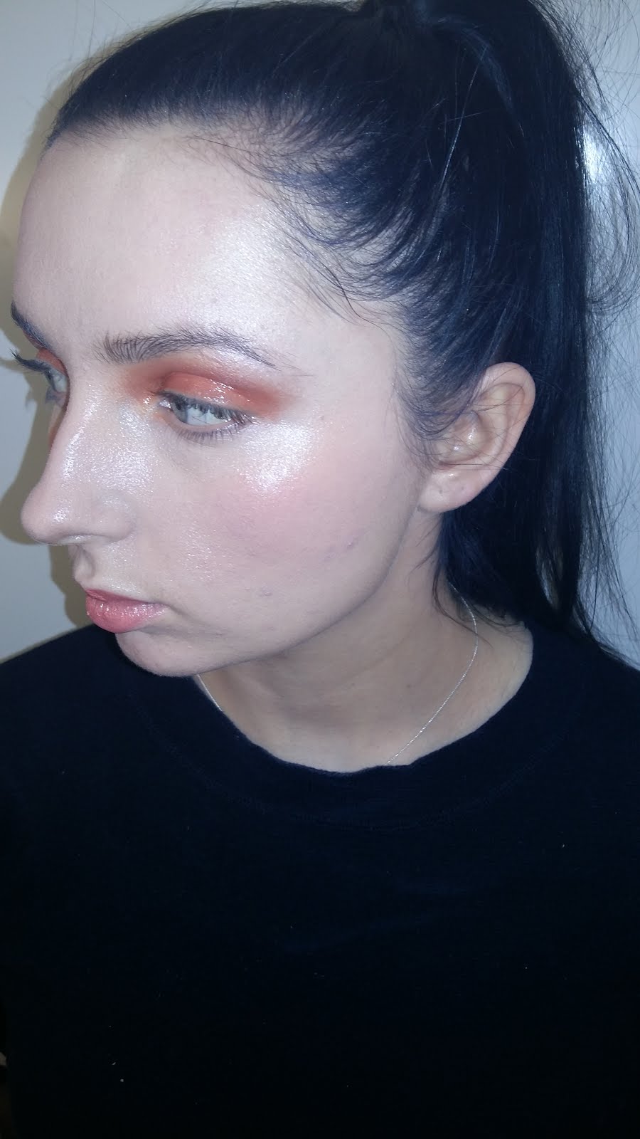
For this lesson we had Lauren covering the lesson and showing the look of an SS16 inspired look with a strong blue eye and then wrapping orange string round the models head which really helped to bring out the eye with them reflecting off each other!


( Model- Georgia Hallgalley, MUA- Lauren )
So after watching Lauren demonstrate we all went off to create an SS16 look. I firstly cleansed, toned and moisturised of course making sure my canvas is glowing to work on. My model has very sensitive skin so for this I used Simple sensitive as its great for sensitive skin. I do use it in every application really but if a client has a preference and brings their own I will happily use that! But if your ever stuck in what to use I recommend as its great for all skin types!
While the products were setting into the skin I primed the eyes with the BALM primer which I love to use works great! I applied a small amount to my ring finger and applied over the lid and carrying this out on the other lid. The reason for my using of the product as it keeps the shadow to last longer but also enhances the pigments of the colour. So with both eyes primed I began to apply MAC rule to the lids which is an burnt orange colour and buffed this colour out over the eyes and bringing in to the corners of the eyes. Once my base colour was applied to add some depth into the eye lightly worked MAC cranberry into the crease of the eye to add some definition to the socket. Nothing too heavy but just a little something to pick up that crease remember ladies less is more! For the brow bone again I wanted something just to pick up the structure of the eye buffing in MUA highlighter to the brow bone. This highlighter is a beautiful highlighter and is such a cheap buy! Available at all superdrug stores for only £4 the light and dark highlighter is worth having in your make up bags or kits! With the base of the eye basically finished I moved on the applying the brow, a nice natural brow and just combed through brow gel and to give a nice touch brushed them up to give that beautiful fashion look. As I wanted this to be quite a beautiful glossy spring/summer look I applied vaseline to the lids as I've become fond of the vaseline look as I love the look it gives! After when we applied the black smoky gloss eye I try to incorporate it in to some looks I apply as I think it gives a nice touch. To finish the eyes I applied mascara to give more definition.
With my eyes applied and the products should have had time to set into the models skin making it ready for when I apply the base! As my model prefers full coverage as she feels face and body doesn't work for her but I didn't want an heavy coverage so I mixed NC15 MAC full coverage and C1 MAC face and body so this made a light full coverage for the skin and applied this to the skin by buffing into the skin making sure its well balanced and applied well. Because I wanted a clean glossy look I then powdered lightly using Kroylan translucent power to the T-zone and kept the rest of the face dewy and to keep this fresh look applying a peachy tone to the apples of the cheek using illamasqua cream blush in rude which I think is perfect for that peachy summer colour and is most definitely one of my favourite products to use specially to give that summer glow us ladies always want! This product is also so great for the lip giving a hint of peach to the lip so applied little to the lip to give definition to the lip. And to finish this look buffed lightly MUA highlighter to the height of the cheek bones and the bridge of the nose. And our final touch of the rose water to add that extra dewey look.
Products used:
Cleanse, tone, moisturiser: Simple sensitive
Foundation: MAC face and body C1 & MAC full coverage NC15
Powder: Kroylan translucent
Blusher: Illamasqua cream blush rude
Eyes: Primer- The BALM, Shadow- MAC rule, Crease- cranberry, Brow bone- MUA highlighter, Finish on eyes: Vasline
Brows: MAC brow gel
Lashes: MAC mascara
Lips: Illamasqua cream blush rude
Finish touch: Rose water
Evaluation
For this look I really enjoyed applying this look and really loving clean fresh looks for spring/summer! All of the products I used throughout this application I love to use lately especially the illamasqua cream as I just think its a must have for spring/summer! As it gives that flush colour with a glow for those warm summer days! With the final image I do like the outcome but if I could change anything would be less rose water as I did want a dewey look but I feel it looks a little to much? And I need to find a balance as in my term 1 assessment I didn't give enough dewey but this time I feel I went a little too much! But all of this I'm learning from and this blog shows my journey my mistakes and make up's I love. With today this to be a look I need to remember to look back on so I can improve the dewey look for next time!
Magazine cover : Final chosen hair ( Thierry Mugler ) & make up ( Burberry )
So I chose my final look from the ss15 trends for hair Thierry Mugler catwalk with the sharpe middle parting slightly sleek to the head and slight wave.

I chose this look to incorporate into my application for the cover because I like the sharpe clean parting a slight sleekness to the top of the head maybe a slight spray of spray to give a slight wet shine look! With a build up of a bodied wave, so its not too plain! When applying this look to create the waves I will be using straighteners to incorporate the waves by making big curls then taking a soft brush and taking through the hair brushing them out into waves to create my look!

With ss15 being such a clean look, going from the same trend as last term which I love! Because in our first term when first given the brief I was feeling it might be boring, but how I was wrong clean make ups have become my favourite lately! With choosing Zac Posen for my first term clean dewy base and bold lip so I questioning if I could do this as its very similar but it's getting practice of creating the balanced lip , with at the start f the year I did struggle with! And the image I have in my head of how I would like my model to look and this is the look that really draws me in! Beautiful fresh skin and beautiful lip specially with the warmth and glow of the skin giving you that summer vibe! So hoping this look I hate created in my head goes amazing in the day!
Monday, 7 March 2016
Hair & Make up inspirations!

So for my magazine cover I have a whole image in my head how I want to create it and really love these hair inspirations from ss15 trends with the first image being Saint Laurent with a slight wind swept straight look but still holding shape around the face. Second Thierry Mugler with a clear sharpe centre parting slightly sleek to the head with incorporating waves to the end of the hair giving more body. Third couldn't get who was for as the site crashed! But same again clean middle parting this time with a looser wave look with more body! To create these look I think straighteners would have been used and for my look I will be using straighteners to create my ss15 inspired look!


For the make up I love this Burberry with the fresh skin and bold berry red lip & with the vision in my head of how I would want my model this is beautiful and would fit the dress amazingly. With make up lately I cant get enough of this clean look I think its so beautiful and really enhances the natural beauty instead of caking make up on! I feel like a new women! When I first started this course I was a heavy make up girl but I had it all wrong and doing these projects are showing me the true beauty of make up! My only worry would be is in my term one final assessment was an Zac Posen which reflects clean look with a bold red lip! But I could of made more dewey so this time may still do this look but make mine own into more of a dewey look!
Found at : http://cosmouk.cdnds.net/14/40/1600x800/nrm_1412072963-spring-summer-2015-hairtrends.jpg last viewd 7/03/16
https://blogger.googleusercontent.com/img/b/R29vZ2xl/AVvXsEhPaR3ljoG-kk6u2As7pQvb4OlQpk06Uow9zebYSiiJFgrjk0zOvxiq-tc4Zl1lgXmBfoqQBmOBcOllE1Yf5ZftaG9quUkeupk_Jm6CnLSkNBacb1SB7WtHD1v4-KsslHuN7nEIMc2K2ji0/s1600/03.jpg
http://redonline.cdnds.net/main/gallery/6524/2-1410858002-burberry-ss15-beauty-trends-lfw-beauty-trends-red-online__square.jpg
Chosen cover: DAZED
So after feeling very torn between both looks I finally went with DAZED, as I wanted to recreate this creative bold look but to create this Idea, to meet the brief is to collaborate with a photographer and stylist to create this project. To take this forward I signed up to a site for creative individuals called the freelancer club this consists of creating a profile with your work and what area you specialize in may this be photographer, make up artist, hair stylist, models. Once all set up I posted a job **NEEDED FASHION PHOTOGRAPHER & MODEL** and below inserted what the project would be and if they would like to collaborate and put my instagram on too so they could see more of my work.

After had been posted my phone got bombarded with messages mainly photographers I then checked out all of their websites and really liked the work of Simon Morris photography and started getting the ball rolling! I said the look I was going for and sent over a mood board of my selected covers. When simon got hold of a designer Stina who actually had a range of dresses, which one actually fits with the Kendall Jenner magazine look so I was really excited to collaborate with these guys as everything was coming together so well better than I thought it would go as I did worry when Branka first gave out the brief!
So I had my photographer and stylist just needed a model! Freelancer had a lot of models getting in contact with me but I just wasn't keen at all, so Simon said he got a model and sent some images of her and at the time I just had to use her as my original model in mind couldn't do the date Simon could. And I didn't want to loose this photographer, so he sent me some images of Rihane and I thought she wouldn't be my choice but I was running out of time and she had this look that I thought may go with the image I'm wanting to create. So at this point I had my whole team to this amazing site. Next on the agenda was sorting the studio costs and Simon kindly went half's with me and I started to think my luck is well and truly in here! And was so excited for this shoot! With everything sorted next on the agenda was the shoot!
Magazine research: DAZED chosen

So I have always been a girl who loves a really creative look always loves to apply a sort of avante garde hair and make up big and bold! And I feel DAZED relates to this well but more in its clothing and background, but does still give boldness out in its make up may favourite covers I have inserted above don't show it as much in the hair but I really do like the bold vibe the covers scream out! Even though lately I've most definitely transformed into an artist that loves to create a clean make up instead of the mad creative look which I never thought would be my thing! Lately I just cant seem to get enough of a clean look!
If I was to produce my cover in this style I would still stick to a clean look but with a bold lip in the style of ss15 Burberry as I would love to try and get a creative clothing as my favourite image is the Kendall Jenner projecting a creative bubble dress look. It really has caught my eye and I would aim to catch the creative eye with a clean base bold lip and simple hair as the attire will be bold and wouldn't the reader to not know where to look! As could all be made to look too busy!
- Burley, I. (2014). DAZED. Available: http://dazedimg.dazedgroup.netdna-cdn.com/537/azure/dazed-prod/1090/8/1098026.jpg. Last accessed 7th march 2016.
- Burley, I. (2014). DAZED. Available: http://media1.onsugar.com/files/2014/01/14/670/n/1922564/13432f6ef8dcccf2_DC229_Cover.jpeg.xxxlarge.jpg. Last accessed 7th march 2016.
- Burley, I. (2015). DAZED. Available: http://www.coverjunkie.com/uploads/1424252231.jpg. Last accessed 7th march 2016.
- Burley, I. (2014). DAZED. Available: http://www.designscene.net/wp-content/uploads/2014/11/Kendall-Jenner-DAZED-Confused-03.jpg. Last accessed 7th march 2016.
- Burley, I. (2013). DAZED. Available: https://visualmaniac.com/uploads/visualmaniac_magazine_number/dazed-and-confused-october-2013-cover-digital-magazine.jpg. Last accessed 7th march 2016.
- Burley, I. (). DAZED. Available: http://cdn.trendhunterstatic.com/thumbs/dazed-and-confused-magazine-3D.jpeg. Last accessed 7th march 2016.
Magazine cover: VOGUE chosen

For my final chosen two magazines to look into more for inspiration towards my final magazine cover. I've chosen one of them to be vogue and created a mood board above to show my favourite look of cover as I feel they relate well to spring/summer. With the background and how soft the background is with the model being the main focal point and really show casing the hair, make up and the style of clothing and this is something I want to produce in my cover to really sell my hair and make up. So the background isn't plain but nothing that takes away the eye from the model!
I love the hair and make up that is used to go with the theme of nature reflecting on the hair and make up with natural glows and soft waves to the hair. I think for the make up they have used a light foundation such as MAC face and body as this is great for camera and doesn't show a heavy coverage. To give the warm glow used a soft bronzer with a highlight hitting the cheekbones to bring forward and enhance that natural glow. Some have a red lip more of MAC Russian red and more natural with a warm glossy nude! Finishing with a warm subtle shimmer MAC cork colour! For the hair maybe used rollers in a brickset form but using the bigger rollers as they show big soft waves! I would apply this with rollers but also create with hair straighteners and then smoothly brush out and would hopefully get a similar outcome!
If I was to choose this as my cover I would go with the more natural look so it goes hand in hand with the background leaving the whole image with a natural beauty shot! Which in my eyes really sets with the look of spring/summer and will reflect our give project magazine cover reflecting ss15 trends.
- Shulman, A. (2015). Vogue. Available: http://i.dailymail.co.uk/i/pix/2015/07/21/14/2AB2D4FB00000578-0-image-a-1_1437486639995.jpg. Last accessed 7th march 2016.
- Shulman, A. (2015). Vogue. Available: https://s-media-cache-ak0.pinimg.com/236x/91/a2/5b/91a25beb2d754007ba811e0a53588c13.jpg. Last accessed 7th march 2016.
- Shulman, A. (). Vogue. Available: http://www.fashiongonerogue.com/tag/claire-danes/. Last accessed 7th march 2016.
- Shulman, A. (). Vogue. Available: http://www.sandrascloset.com/tag/us-vogue/. Last accessed 7th march 2016.
- Shulman, A. (2015). Vogue. Available: http://www.sandrascloset.com/tag/us-vogue/. Last accessed 7th march 2016.
- Shulman, A. (2015). Vogue. Available: http://i46.tinypic.com/11lieko.jpg. Last accessed 7th march 2016.
Magazine research:VOGUE


The first issue of vogue came out in America 1892, Arthur Turnure founded vogue as a weekly news paper sponsored by Kristoffer Wright with the first published on December 17th 1892.
In 1909 became acquired by Conde Naste publishers. Vogue became thicker and its main focus was turned to us ladies, with the price raised as well.
1916 hit the selves of England, with it being a success 1920 the first issue of French vogue was released.
In 1932 American vogue for the first time ever had placed a colour photography on it's cover as before it was drawings for the front cover! But when it went to colour photography the worlds best photographers all contributed to the covers with the photographers being Irwin Penn & Guy Burden, Richard Avedon & Norman Parkison, Helmut Newton & Peter Lindberg.
With given a slight background of the first release of vogue and where I'm going to go into more detail with the British vogue our "fashion bible" with vogue today with editor in chief Alexandra Shulman taking the reins from Elizabeth Tilberis in 1992 since she has drawn in more than over a million readers and is know for her attempt to change the face of fashion with pushing designers to stop the "size zero" models, and getting such good feed back from women all over the world. As we should all feel beautiful no matter what size we are and I think this says a lot about the magazine not only do they want to deliver beautiful covers and articals on fashion but try and change the view of all sizes are beautiful and knock that "size zero" out the park because we are all beautiful and I think a lot of magazines still tend to stick to that whole skinny can only be fashionable and happy people like Alexandra are trying to change things, so go you alex!
Vogue's hair and make up on the covers always presents the elegant women to me always beautiful hair and make up nothing too wild or out their just enhancing the models natural beauty which im very found of at the moment as before this course I use to be more of an avante garden hair and make up girl! But being shown the techniques to apply a full face but in more of a natural form and not so heavy giving that " less is more " is one of my favourite make ups at the moment using a light foundation such as MAC face and body and if you want heavier you can build this! with a slight cream blush just gives such fresh skin! Im not saying vogue do this all the time but their make ups are more calm compared to other magazines as like the ones I've researched LOVE, I-D, DAZED & HUNGER.
WHAT ARE THEIR CHARACTERISTICS? STYLISH Vogue readers spend more on fashion each year than readers of Elle, Marie Claire, InStyle, Vanity Fair and Harper’s Bazaar
LUXURY CONSUMERS 93% of Vogue readers own designer fashion
94% own premium beauty
INFLUENTIAL When Vogue readers last recommended a product to their friends, 54% of cases resulted in a purchase
AVERAGE AGE Print: 35 years old Tablet: 37 years old Website: 28 years old
- Fig 1 Shulman, A. (). Vogue. Available: https://s-media-cache-ak0.pinimg.com/236x/ed/bc/c7/edbcc707c1f3d1c1d36099717024f048.jpg. Last accessed 7th march 2016.
- Fig 2 Shulman, A. (1950). Vogue. Available: https://dottytheresa.files.wordpress.com/2014/03/vogue-cover-june-1950.jpg. Last accessed 7th march 2016.
- Information - Shulman, A. (). Vogue. Available: http://digital-assets.condenast.co.uk.s3.amazonaws.com/static/mediapack/vogue_media_pack_latest.pdf. Last accessed 7th march 2016.
- Information - Shulman, A. (). Vogue. Available: https://en.wikipedia.org/wiki/Vogue_(British_magazine). Last accessed 7th march 2016.
- Information - Shulman, A. (). Vogue. Available: https://www.condenast.ru/en/portfolio/magazines/vogue/history/. Last accessed 7th march 2016.
Sunday, 6 March 2016
Magazine research: HUNGER


HUNGER what great covers I've never really looked into this magazine until now and I just love the covers how dark they look but in a beautiful creative way! HUNGER is biannual magazine by photographer and publisher RANKIN who is also founding editor of the well known magazine Dazed & confused! HUNGER was published in November 2011 with wanting to give the vibe of creativeness and cultural feel. When HUNGER was launched it came out with HUNGERtv that is a video based website with in depth interviews of the people that are based in the magazine & your regular stories on the stars and updates on HUNGER and what's to come! The audience I feel will be the creative culture mind set people as what the magazine projects with on the inside of the magazine and the front cover!
The hair and make up is beautiful so strong and bold to really feature out in the black and white photography and the application of the model relates to the font of the lettering as you see on the left the logo as if its dripping down and then the models hair is loose waves but looks wet and the make up is dark and bold with a smudge liner under the eye to give a smoked look and for the lip a bold matte black for a sharpe bold lip! The right cover the font is more elegant then with the model holding her head high really showing the structure of the jaw line and beautiful long neck the make up showing a nice chiselled cheekbone with the whole base and lip being quite a highlighted and contoured look with an creative eye liner to the lid.
The hair and make up is beautiful so strong and bold to really feature out in the black and white photography and the application of the model relates to the font of the lettering as you see on the left the logo as if its dripping down and then the models hair is loose waves but looks wet and the make up is dark and bold with a smudge liner under the eye to give a smoked look and for the lip a bold matte black for a sharpe bold lip! The right cover the font is more elegant then with the model holding her head high really showing the structure of the jaw line and beautiful long neck the make up showing a nice chiselled cheekbone with the whole base and lip being quite a highlighted and contoured look with an creative eye liner to the lid.
- Fig 1 RANKIN. (2012). HUNGER. Available: http://scriptical.files.wordpress.com/2012/05/scriptical-wordpress-helena-christensens-cover-and-editorial-for-the-hunger-magazine-2-summer-2012-11.jpg?w=700&h=916. Last accessed 6th march 2016.
- Fig 2 RANKIN. (2015). HUNGER. Available: http://www.fashiongonerogue.com/wp-content/uploads/2015/02/hunger-magazine-spring-summer-2015-cover3.jpg. Last accessed 6th march 2016.
Magazine research: I-D

i-D is a well known magazine to us creative individuals and the magazine built its reputation on being a consistent source of inspiration in fashion culture. It started off with their main vision to the street style of punk-era London in 1980, and quickly earned its position at the vanguard of fashion and style. i-D has come a long way since its pre-digital, cut-and-paste days and has developed into a glossy magazine that documents fashion and contemporary culture, and has broken ground defining it too. Constantly reinventing itself, and with their website continues to encourage creativity which each magazine need to keep their website eye catching as soon the magazines will all be purchased on-line , with after more than 30 years, its editorial content still manages to surprise and inspire the nation with creative vision of front covers that pull us in!
My question was when researching this front cover and a lot of other people may question why do i-D always give the wink? and I'm about to answer why....
The ‘i-D’ is to represent a winking smiley face which often used by young people when texting. The cover models either wink or cover their right eye to depict the smiley. ‘I.D’ can also refer to identity which represents a young body trying to find their indemnity and means to find their inner identity within the magazine.
The magazine front cover usually has a word on it do with youth, again appealing to a younger audience .
Their advertisement also reaches out to a younger audience with the magazine having a sound cloud, tumblr, you tube, Facebook, twitter and their on-line website giving the magazine so much advertisement over social media as today everyone hits the net instead of the shelf's!
- Fig 1 Jones T. (2004). I-D. Available: https://sites.create-cdn.net/siteimages/5/5/8/55872/15/8/3/1583178/313x400.jpg?1. Last accessed 6th march 2016.
- Fig 2 Jones T. (2012). I-D. Available: http://i.mdel.net/mdx/i/2012/03/318-COVERGuinevere.jpg. Last accessed 6th march 2016.
- Fig 3 Jones T. (2012). I-D. Available: http://fashionbombdaily.com/wp-content/uploads/2012/08/Twigs-by-Matthew-Stone-for-i-D-Magazine-320.jpg. Last accessed 6th march 2016.
- Fig 4 Jones T. (2015). I-D. Available: http://www.konbini.com/en/files/2015/04/stewartMIA_id_-787x1024-786x1024.jpg. Last accessed 6th march 2016.
- Information - Jones T. (). I-D. Available: https://prezi.com/hjs3c9gykp0p/i-d-magazine-audience-research/. Last accessed 6th march 2016.
Magazine research: LOVE

Love was founded in 2009 by stylist and fashion journalist Katie Grand which who today remains as editor in chief. With showcasing it's beautiful glossy pages and raw images being presented in black and white showing off the chiselled features of a beautiful women. Also presented in colour some being bold and some have a muted palette as if the images have aged and faded. Hitting our shelf's twice a year one to cover spring/summer and autumn/winter being quite popular with 400k gross international readership and International monthly unique users of 80k giving their readers the latest on fashion, style and culture. Mainly their audience being between 18yrs-40yrs as the publishers are trying to reach out to the younger generation because soon they will want to just move on-line as they at the moment they publish on-line, in print and ipad but fear soon the print media will die out as the amount of people buying physical copies today is decreasing. So Love do target to the younger generation for this reason.
The hair and make up does show a range from highly contoured and highlighted giving strong structure to the cover and then your playful cover with loud colours using coloured pigments and bright blushers to bring certain features of the face out.
- Fig 1 Grand K. (2013). LOVE magazine. Available: http://printandpattern.files.wordpress.com/2013/01/love-magazine-spring-summer-2013-preview-glamour-boys-inc-02.jpg. Last accessed 6th march 2016.
- Fig 2 Grand K. (2016). LOVE magazine. Available: http://www.eonline.com/eol_images/Entire_Site/201604/rs_634x820-160104113556-634.lily-rose-depp-love-magazine.1416.jpg. Last accessed 6th march 2016.
- Fig 3 Grand K. (2011). LOVE magazine. Available: http://www.gotceleb.com/wp-content/uploads/celebrities/kate-moss/love-magazine-spring-summer-2011/kate-moss-love-magazine-spring-summer-2011-07.jpg. Last accessed 6th march 2016.
- Fig 4 Grand K. (2015). LOVE magazine. Available: https://i.mdel.net/i/db/2015/1/339285/339285-800w.jpg. Last accessed 6th march 2016.
- Information - Grand K. (). LOVE magazine. Available: https://en.wikipedia.org/wiki/LOVE_(magazine). Last accessed 6th march 2016.
Friday, 19 February 2016
Magazine research: DAZED

Beginning my magazine research with an exciting front cover magazine DAZED, I selected this magazine to be one of my five magazine's to research because the covers always draw me in with the bold colour, bold lettering, strong structure of position within the model and I just love that most of their covers incorporate abstract within the work some way whether this in shown within the clothing or the background and really shouts out an creative read!
DAZED is formerly known as Dazed & confused which is a monthly British styled magazine that was founded in 1991 by the founding editors Jefferson Hack who has an reputation for success in journalism, film, photography, television, digital media and Rankin who's a well known successful fashion photographer. DAZED did hit the magazine world first as a black and white poster but soon became colour promoting music, fashion, film, art and literature. And the articles telling us what happening in the world of music fashion and art with the articles being a mixture of informing their audience with news and also the own opinion especially in the music articles as it holds quite a few news and opinions on the through the wire singer Kanye West. The audience of Dazed is to be a lot more open minded of beauty and views as a lot of their covers show a visual frame of thin models to reflect more of a masculine frame. With make up applied not to flatter the feminine features but make up that makes features more masculine that goes hand in hand with the bold abstract feel to the overall image.
- Fig 1 - Tim Noakes. (2013). DAZED. Available: https://visualmaniac.com/uploads/visualmaniac_magazine_number/dazed-and-confused-october-2013-cover-digital-magazine.jpg. Last accessed 19/02/2016.
- Fig 2 - Tim Noakes. (). DAZED. Available: http://cdn.trendhunterstatic.com/thumbs/dazed-and-confused-magazine-3D.jpeg. Last accessed 19/02/2016.
- Fig 3 - Tim Noakes. (2015). DAZED. Available: http://fasttw.com/wp-content/uploads/2014/11/Kendall-dressed-in-a-total-lookbook-Urban-Outfitters--590x768.jpg. Last accessed 19/02/2016.
- Fig 4 - Tim Noakes. (). DAZED. Available: http://i.dailymail.co.uk/i/pix/2014/11/25/237E959500000578-2849010-image-12_1416931441655.jpg. Last accessed 19/02/2016.
- Fig 5 - Tim Noakes. (2014). DAZED. Available: http://www.theluxechronicles.com/.a/6a00e54f05e1bb883401a3fc41f67d970b-pi. Last accessed 19/02/2016.
- Fig 6 - Tim Noakes. (2015). DAZED. Available: http://www.newsstand.co.uk/i2440068/Zoom/DAZED--CONFUSED_SPRING.jpg. Last accessed 19/02/2016.
Subscribe to:
Comments (Atom)